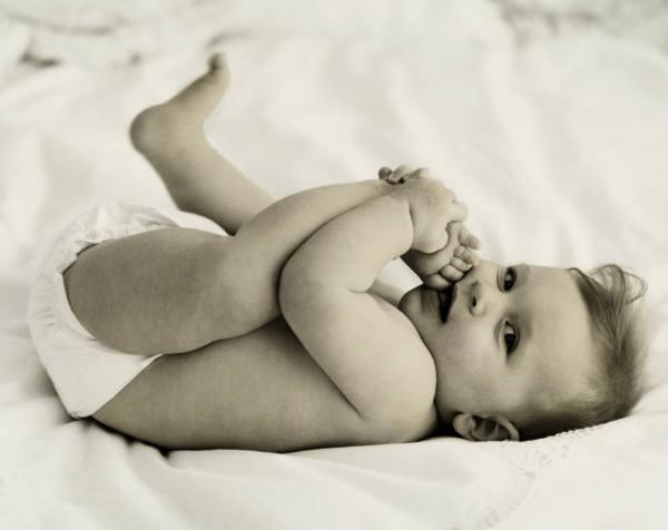
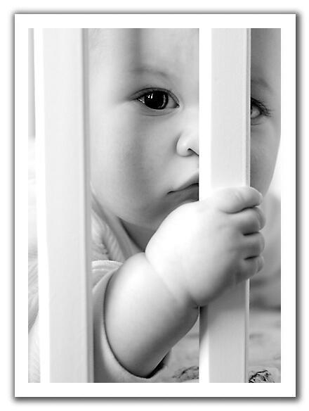
The placement of the photos are out of place as well – for two photos laid side-by-side, the border of one photo was missing, while the other had the border, plus some extra space! I just don’t get it – the layout was fixed in the software, so it’s not as if I could change the alignment.

And this didn’t happen to just one page, several pages had the same problem.

The only saving grace for the book is the presentable cover, but still, I had the urge to just chuck the book away in a corner of the drawer – that’s how DISAPPOINTED I was with the quality. And you can bet a million dollars that I’ll stay far far away from Pixart for future photobooking projects.


7 comments:
oh boy...that's pretty bad output they produced.. they should at least check first before they print
Exactly...and the photos look so faded, really terrible quality.
Gosh!!!!!! they shud have informed you about that before they produce your book.
thanks for posting this. it's a good warning for other people who are considering using pixart's services.
you looked radiant preggers btw :)
Chinnee, exactly my sentiments.
Mimi, there are some new developments to this saga. Will write about it once everything is sorted out. And thanks for the compliments.
Eee...that's pretty bad! Pixart has been enjoying a good rep since its launch - wonder what happened eh?
Did you feedback to them? Any response?
Kittycat - they actually contacted me coz they read my post. They proposed something to rectify the situation but it's been a week and I've yet to hear from them again.
Post a Comment